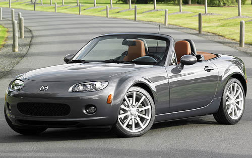
Modern car designers are also keen, devoted poets. Well, only that would explain their increasingly profound sources of inspiration for the work they do.
I can understand design cues which hark back to older models in order to create hype around classic forms and pull at the target market’s nostalgic heartstrings. That’s why a Porsche 911 today looks the same as the one made in the 70s.
However, things have become a lot more complicated. That which motivated your design is now thrust into the limelight with the same oomph as the design itself.
Nadya Arnaout, the lady responsible for the design of the new BMW Z4’s dashboard, claims that she was inspired by the “female figure.”
She went on to say that “It was to me a similar thing of how the body flows. Especially the female figure… It makes it very emotional and sexy.”

 Nadya's "female-inspired" Z4 interior
One wonders if she sprawled herself down in front of a mirror, drew a self-portrait and suddenly, right there on her piece of grained arty paper, appeared the new Z4’s dashboard.
True, the new Z4’s interior is a sumptuous place in which to watch the world go by at warp-speed, and perhaps some men enjoy the site of a woman laying an arm’s length away, provided they look closely enough.
The Volvo S40’s cockpit was another result of a “dramatic” light-bulb moment. Its designers crafted the controls to mimic those of a household remote control.

Volvo's "remote-control" console
Why? So that the driver can fight over what temperature the air-conditioner is set at with his noisy brood? How about designing the dashboard around the needs of, I don’t know, the driver?
Similarly, the new Ford Fiesta’s dashboard layout is said to be inspired by mobile phone interfaces.
 One day, your cell phone might be inspired by car dashboards...
Then again, designing a car around the most important thing – its occupants – can result in a dicey (not in the Cape-coloured colloquial sense!) finished product.
The first Fiat Multipla was said to be designed purely around the needs of the six passengers it could accommodate. But just look at it!
 Those six passengers may have plenty of room in which to stretch out, but all you actually want to do when travelling in the Multipla is to curl up into a ball and hide from the people driving around you in normal cars, many of whom will be pointing, laughing and/or gagging.
Another “comically inspired design offender” is the aircraft-style handbrake found in Renault’s Megane II. As you will have surmised, it was inspired by aeroplanes.
While this may make for an interesting conversation piece, the lingering question will still be why it was necessary. A simpler way to funk up a handbrake would be to slap a piece of leather or chrome on it.

Renault's "aeroplane-inspired" handbrake
Of course, that means Renault wouldn't have been able to mention the aeroplane reference in the media press-kit, thereby enabling them to give the false impression that the Megane actually flies.
More bizarre still are the explanations provided for concept car innovations where designers have the freedom to really push the boundaries in every sphere, their ostentatious imaginations included.
The aggressive Lamborghini Insecta concept car’s exterior was enthused by the exoskeletons of insects.

Lamborghini Insecta
Let’s say the Insecta made it to production and Christiano Ronaldo bought himself one with some spare change. I somehow don’t see him bragging about the bone-inspired design to his mates in the locker room.
More hilarious than all of these is the headlight design of the Volvo S60 concept car. An official article explaining the detail of the lighting elements that made up the headlight proclaimed the following.
I suggest referring to the picture as you read this.

Volvo S60 "ship-inspired" headlights
“In each of the headlamps, the lights create a silhouette of two miniature Viking longboats sailing side by side, one for the main beam and one for the dipped beam. When driving in the dark, the light is reflected from the concealed, upward-facing High Performance LED bulbs, projected by the ships’ filled sails.”
That one makes me giggle every time and after hearing about all of these, I can only wonder what we’ll hear about next. Perhaps a speedometer inspired by a bathroom scale? Or maybe a group of buttons inspired by the control panel in an elevator?
I’m no designer myself and can well imagine the task of creating something new and fresh in a constantly changing industry to be incredibly arduous.
In that regard, I commend these professionals on their creativity.
Sometimes, however, a brilliant design is best left to speak for itself.


