Saturday, September 26, 2009

Road safety: the modern visibility hazard

Have any of you noticed how enormous the dashboards fitted to modern cars have become? Where 10 years ago you could sit in the driver’s seat of your car and easily reach out and touch the windscreen, this simple manoeuvre is now impossible in plenty of new cars.

This unusual characteristic of modern vehicle design has become popular for what I believe to be the following reasons:

Renault Scenic interior

- - Acres of elongated dashboard together with larger windscreens and thicker A-pillars are simply a contemporary design feature and perceived as very “now” and stylish.

< - Far more extensive and complicated safety features and especially the adoption of airbags are better integrated into a large dashboard design. Also, drivers are now positioned a lot further from the windscreen than before and this makes sense from an increased safety perspective.


All of which is wonderful in theory. A swoopy dashboard with curves in all the right places, a multitude of airbags and plenty of buttons to touch makes the modern car interior a treat for both the family man and the self-confessed technocrat.

However, UK-based WhatCar magazine ran what I believe to be an extremely underrated car safety study in 2003. They termed it the “visibility test” and they tested all the most popular cars from all segments of the market to determine how easy they are to see out of from the driver’s seat.

The results were quite shocking. MPVs like those from VW and Opel faired especially poorly, and these “mom’s taxis” are known for their large dashboard / thick A-pillar design.

Take a look at the picture of this recently-replaced Honda Jazz and one can see just how expansive the dash is. It had the second worst score in the survey and obstructed a significant portion of the driver’s sight on each side with those obtrusive A-pillars.


Honda Jazz interior


Even the tiny “quarterlights” (those miniscule non-opening windows fitted to the Jazz and lodged between the rear-view mirrors and windscreen) could do little to alleviate the lack of forward-vision.

I’ve driven a Jazz and I currently drive a previous-generation Ford Fiesta and can vouch for the inconvenience of having to stretch forward when going around certain corners to see clearly. It’s a problem that simply didn’t exist in the huge ’91 Toyota Cressida I used to drive!


It's a phenomenon worthy of consideration; has safety technology and subsequent changes to design become too smart for its own good?

Well, consider the Mini Cooper. WhatCar tests confirmed that Mr. Bean’s version offers an extra 10m² of exterior visibility compared with the 6-speed, supercharged, two-tone beast I would love to drive. Admittedly, WhatCar ran these tests based on the 2003 Cooper but with the 2009’s design having hardly changed, one can expect much of the same. This is despite the modern Mini's fairly shallow dashboard which indicates that visibility is badly affected by those thick A-pillars.


New Mini interior


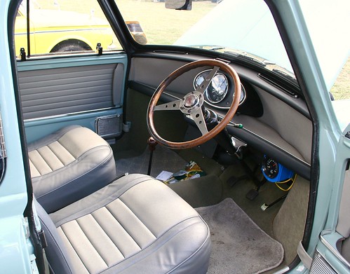
What all this means is that the 2009 Mini Cooper looks and protects you a million times better than the one that became an icon in the ‘60s, but the old one gave you a far better chance of spotting a potential hazard and avoiding an accident in the first place!


Old Mini interior

Tuesday, September 22, 2009

eCCCentric C3

Many of us know of the Citroёn C3. A trendy, clever and comfy “boutique” hatch sold in the lively supermini segment of the market.
What many are largely unaware of is the closely-related Citroёn C3 Pluriel. About as common as Paris Hilton winning an Oscar, this exceptionally unique vehicle was launched on the South African market back in 2004.
I can’t recall ever spotting one of them on the road, though, and it’s not difficult to figure out why.

The C3 Pluriel (good gracious, even the name is ridiculous) was conceptualised and designed as a single vehicle to cater for a mind-boggling array of needs.
So, provided you misplaced your mind and good sense of judgement and purchased a Pluriel, you could theoretically configure your new pride and “toy” as a hatchback, pillarless coupe, cabriolet or even a good old fashioned bakkie / pick-up.

The brutally burning question is why you’d want to do all this. The answer is simply that you would not.

To be fair, Citroёn has always been about forward-thinking and the showcasing of design trends which rival manufacturers would only pick up on years later. Think Citroёn DS or the legendary 2CV to get an idea of what I’m getting at.
The C3 Pluriel, however, is complete and utter overkill.


The intricate roof structure consists primarily of two, 1,85m, 12kg arches. They are as easy to remove as a loose-fitting jacket, but not remotely near as easy to store.
Let’s get real. You’re looking fabulous cruising along the Camps Bay beachfront and decide to go topless – with your Pluriel, that is…

What on earth are you then expected to do with 24kg and almost 4 metres of the stuff?
You could of course leave them at home and take comfort in the fact that should you get caught
in an unexpected thunderstorm, Citroёn has thoughtfully equipped the Pluriel with mildly
water-repellent seat fabric. Just be sure not to rub your skin over the coarse material too
enthusiastically.

My advice is simple. Don’t buy a Citroёn C3 Pluriel.

The Mini Clubman, Ford Ka, Citroёn’s very own C4 and plenty of other oddballs out there represent far more practical ways to stand out in a crowd.

Friday, September 18, 2009

When Run-Flat means run home


I admire BMWs and always have for their immense innovation and willingness to push the boundaries of design and technology.
I even went against all the backlash that the company faced and has faced since 2004 when they began fitting their vehicles with Run-Flat tyres.

Essentially, Run-Flats are fitted with far thicker sidewalls than conventional tyres. This allows – by BMWs claims – a car with a flat tyre to be driven up to 80km/h and for a distance of 150km while the driver remains in complete control.
The advantages are clear; no need to stop on the N2 at 3am in the morning and climb beneath your car in an ungainly fashion to locate the spare. Safety is a major concern for many and Run-Flats, in principle, eliminate this worry.

I would be willing to drive a car with a slightly harsher ride quality (due to the stiffer rubber) and to pay more for repairs to enjoy the luxury and sheer convenience of this technology.

However, the owner of a BMW X5 recently wrote into CAR magazine. He was on the long road, got a flat tyre and, unfortunately, ran into disaster.
The tyre deteriorated until it no longer existed. The desperate owner still pushed on to reach some help, but was eventually left stranded 150km away from anything with an immobile vehicle and a ruined alloy wheel (which will probably end up costing close to 10k, if not more, to replace).

So, in conclusion, and I absolutely loathe to admit this, but BMW has gotten ahead of itself here. Perhaps Run-Flats will work in other parts of the world where shorter distances are covered. In South Africa, however, BMW (or any other manufacturer) simply doesn’t have the coverage or infrastructure to send a 24 hour emergency support team out everytime someone gets stuck in the Karoo after having passed their 150km limit.

Thursday, September 17, 2009

Never overtake on a blind rise (or in the face of a new Audi)

Audi produces fantastic machines, but even a prestigious brand such as this one can take things a tad too far sometimes.
The new, dramatic and cornea-shattering LED daytime driving lights fitted to many new Audi’s are certainly worthy of a second glance, but they seem like a desperate cry for attention.

Let’s get real. If it is illegal to fit two (admittedly ridiculous) small luminescent little lights mounted to the water “squirters” placed on your bonnet - or to operate your fog lights in conditions that are not, well, foggy - then why is Audi allowed to fit dozens of dazzling, merely aesthetic lights to its cars?
And then to call them “daytime driving lights”; it’s as if the sun could suddenly no longer break through the swathes of pollution in our atmosphere and these Light Emitting Diodes were all that motorists could rely on to see each other.

That being said, many other manufacturers have also caught onto the LED lighting craze and when well-incorporated into the design of the car, it does make for a striking visual spectacle, especially at night.

Don’t be surprised to see this fad catch on as quickly as the clear plastic covers on headlights did in the nineties.
Before long, in the unfortunate case that Fiat continues producing the Uno, it too will be sporting LED’s more powerful than the engine fitted to this tin box.

Wednesday, September 16, 2009

Why Daihatsu Can't Keep A Straight Face

With the corniest of mutterings now being splattered across personalised number plates everywhere, it seems a more curious characteristic has emerged when it comes to these vehicle identification appendages.

Well, that is if you drive a certain Daihatsu.

A few days ago, I was sitting in my car when I spotted the oddest thing on the front-end of a Daihatsu Charade parked opposite me.

The Charade’s number plate was positioned about 20 to 30cm off centre.


Daihatsu Charade

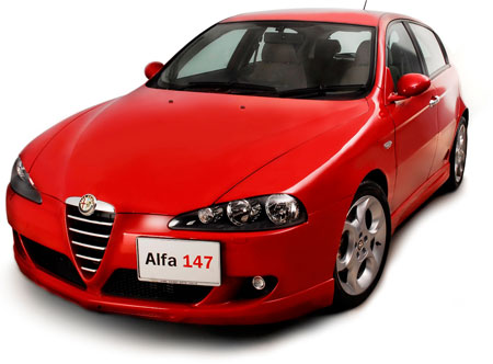
The only other car I could think of with this feature was a few Alfas. Of course, the Alfas all had the off centre number plate purposefully integrated into its overall design and it looks quite neat.

Alfa 147

Number plates, while primarily a means of vehicle identification, are also integral to providing the front and rear of any car with a balanced, harmonious aesthetic.

On this poor Daihatsu, however, the number plate resulted in an already oddly proportioned car looking even more like it was about to tip over.
Imagine, just for a second, if Mercedes-Benz decided to place their bonnet-mounted 3-pointed star a ruler’s length to the left and you’ll get an idea of just how bizarre the Daihatsu appeared.
I felt ridiculous staring at a silly number plate and eventually left it down to someone, somewhere, in some workshop, who had simply re-attached the number plate incorrectly.

You can well imagine my shock when, over the next day or two, I spotted several other Charade’s (new and old) and previous generation Sirion’s nonchalantly sporting the same misplaced number plate!

The Copen micro sports car as well as the older Cuore prove that this oddity is common to almost all the brand's humiliated models.

Daihatsu Copen

Daihatsu Cuore

Perhaps this is Daihatsu’s cost-effective means of keeping a family resemblance between all their models instead of resorting to, say, the humongous grill now found on all Audi’s?

At least there are a few Japs out there with a greater sense of humour than the ones that designed the dull Corolla.

Tricky Trends

In the great world of cars, trends good and bad are followed relentlessly. Manufacturers get so caught up in “the moment” of what’s perceived as trendsetting that they often design features or sometimes entire cars that actually go against the very essence of what their brand stands for.

Somehow, the Toyota Yaris doesn’t come standard with an air conditioner or alloy wheels and yet it is fitted with an extravagant centrally mounted digital (on the hatchback, analogue on the sedan) instrument display. The Renault Scenic is another example of this instrument display.
Do these manufacturers not know that if something is not directly in your line of view, your significantly inferior peripheral vision takes over? Hardly conducive towards safe family motoring, something both Renault and Toyota strive to provide.

Then we have the first generation Polo Classic (at least, the first generation launched in South Africa).
While it was seriously unpretty / boring and therefore couldn’t have had ambitions of setting any trend, it nevertheless was fitted with a design feature that (and I stand to be corrected here) I had never before seen on a car and which spread rapidly to other vehicles – namely, a single rear reverse light.
There can be no logical explanation for this besides cost-cutting. What it does is to provide the rear of your car with an unbalanced appearance and permanently make it appear as though one reverse light is broken. It is also less safe – if anything happens to be obscuring the side of the vehicle without that reverse light, those viewing it from behind won’t always know it’s moving backwards.
Seems a petty concern, but it’s simply unnecessary.

It is my next “trend” that really gets me hot under the collar (and depending on which car I happen to drive, her too!).
Apparently, modern vehicles have become so impeccably well engineered that some of them no longer require the once obligatory temperature gauge. All that is now needed is a single and often miniscule red lamp in the instrument panel that illuminates once your engine is probably on the verge of exploding while you’re traversing De Waal Drive at 20km/h on a Friday afternoon.
The very point of a gauge is to be able to constantly be aware of how warm the engine is. This way, you’ll be alerted instantly when it starts to heat up and long before steam starts spewing from underneath the bonnet of your Chevrolet Spark (which, you guessed it, is one of the offenders).
As advanced as they have become, modern vehicles’ engines still run on petrol, they still rely upon a cooling system and they can still overheat.

Car names are another moot point. It seems as though designing a car from scratch takes so much effort that there is insufficient brainpower left for the team to think up a reasonable model name.
Volkswagen has loads of fun revising its dated CitiGolf every 5 days or so, complete with new individual designations for each model in the line-up that range from an eerie canine to a synonym for doggedness; I doubt anyone will feel very good telling their mother-in-law that they drive a Citi Wolf or a TenaCiti. A sharply raised eyebrow is sure to follow.
Manufacturers of 4X4s are perhaps even worse. They can’t resist the tendency to drown their gas-guzzling beasts in an hilarious assortment of masculine words like Defender, Discovery, Commander or Outback. Or, if you often indulge in the odd trip around your backyard, you could get yourself a VW Touran Track and Field. Not many could have predicted that cars would one day be named according to the surface they’re adept at driving on.
Let’s all hold thumbs for a BMW X5 Road and Driveway.

But perhaps more bizarre than all of these is a car that tries extremely hard to be trendy when it is actually quite terrible.
The range-topping Tata Indigo GLX comes standard with awful interior plastics, a breathless engine, refinement notable only by its absence and… a dual rear DVD entertainment system. Hell, they’ve even thrown in leather upholstery. Whether it’s real leather or not is highly
debatable.


Tata Indigo

What it all boils down to is that far too often, being perceived as cool, funky or trendy takes preference over reliability, practicality and good old common sense.
Then again, who would say no to the ridiculously overindulgent fingerprint recognition system on the Audi A8 that adjusts seats and the like to your preferences at the touch of a little electronic pad…? Not me.